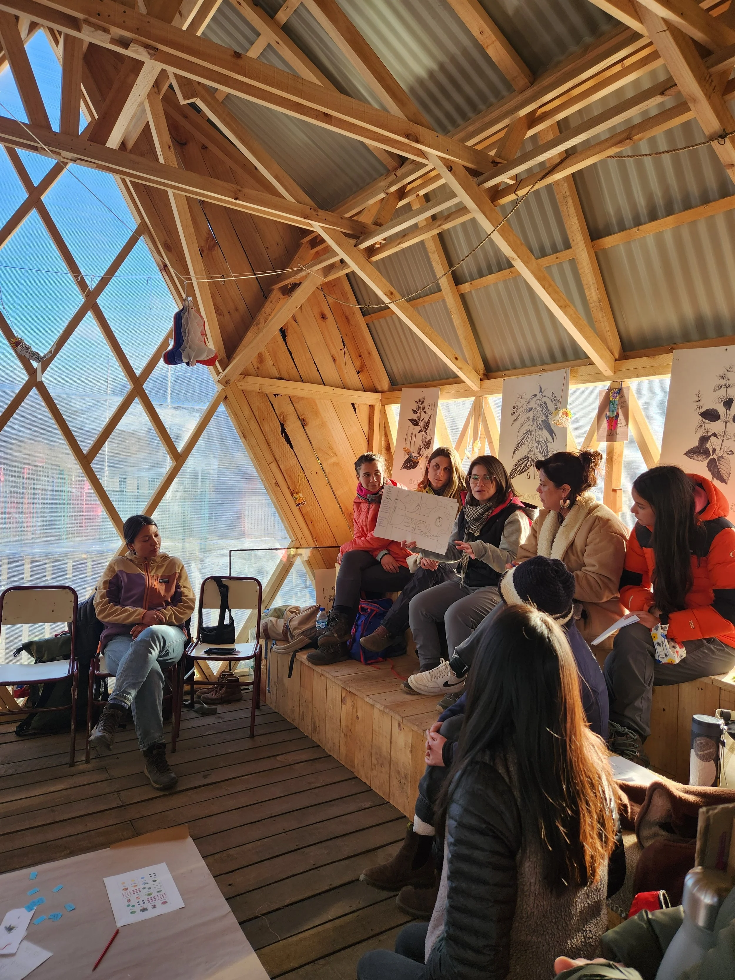
“A website designed to support the mission of strengthening the ecological sustainability of communities in Patagonia”
Trek Relief needed a clean, human-centered website that implemented their new visual branding and conveyed their grassroots mission with clarity and emotional resonance. The original site lacked cohesion, cultural sensitivity, and didn’t reflect the organization’s evolved identity or values — especially their emphasis on co-creation, trust, and simplicity.
Solution
A layout grounded in a modern, nature-driven design language.
The redesigned site delivers a calm, editorial-style experience that aligns with Trek Relief’s desire to feel inspired, trusting, and empowered. By implementing a bilingual layout grounded in a modern, nature-driven design language, the site better connects with both international supporters and the Patagonian communities it serves. The interface avoids savior narratives and corporate coldness by focusing on people, stories, and place.

Discovery
I began by reviewing Trek Relief’s brand identity materials and aligning with their goals: to create a site that felt relatable, inspiring, and rooted in place.
During collaborative sessions with the Volunteer Manager, we explored example sites the team admired from Fundación Kreen’s magazine-style layouts to Endémico’s blend of art and ecology. We also clarified what to avoid: clutter, cold tones, and condescending language.
Milestone 1: Discovery
Milestone 2: Initial Design
Milestone 3: Final Design Delivery
Brand & Mission Immersion
I began by deeply understanding Trek Relief’s mission, voice, and design goals. This included reviewing their newly developed visual branding and style guide, along with background materials about their work in Chilean Patagonia.
Stakeholder Collaboration
I met with the Manager to clarify design goals, technical constraints, and content priorities. We discussed how to build trust with a broad audience and reviewed existing challenges in the site's layout and structure.
Creative Research
I analyzed visual references provided by the team (to identify shared themes: editorial layouts, natural imagery, emotional tone, and simplicity. I also documented what to avoid and used these insights to guide future design decisions.
About
A bilingual website redesign
This bilingual website redesign supports Trek Relief’s mission to strengthen ecological and economic sustainability in Chilean Patagonia by empowering local communities through co-created gardens, outdoor classrooms, and environmental education.
Problem
Implementing new visual branding and conveying their grassroots mission.
Sitemap
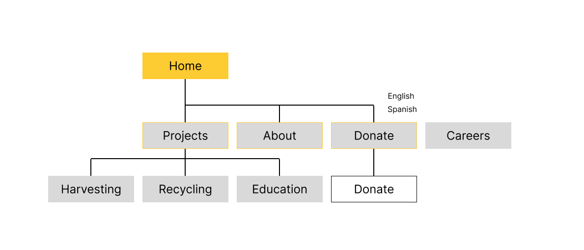
The sitemap clarified site hierarchy and user flows across three key goals: learning about the mission, supporting the work, and getting involved. It helped structure both English and Spanish content for ease of navigation.

Initial Design
Using the provided style guide and wireframes, I developed a set of high-fidelity mockups that incorporated bilingual content, generous whitespace, and nature-focused imagery. We went through six rounds of iteration to refine alignment, image use, typography, and layout flow. I worked to ensure the design spoke to a broad audience: donors, educators, and local Patagones.
Wireframes
Low-fidelity wireframes provided a clear structural foundation, allowing us to focus on visual rhythm and information hierarchy before applying branding elements. These also helped identify missing or underrepresented content early in the process

Mockups
I began by deeply understanding Trek Relief’s mission, voice, and design goals. This included reviewing their newly developed visual branding and style guide, along with background materials about their work in Chilean Patagonia.
Feedback & Iteration
Over four rounds of collaboration with the manager, I refined layout elements, adjusted image usage for greater relatability, and fine-tuned alignment, spacing, and content clarity. Each round focused on improving accessibility, visual balance, and emotional tone — ensuring the design resonated with both local and global audiences.

Final Design
The final deliverable included annotated designs, layout specs, and a simplified style guide for implementation. It emphasized modularity, visual storytelling, and clarity ,making it easier for users to explore projects, get involved, or support the organization financially.
Final Visual Design
After multiple rounds of iteration, I finalized a cohesive and responsive visual design that faithfully implemented Trek Relief’s updated branding.
Style guide and Design notes
To support future development and content updates, I delivered a comprehensive style guide that detailed typography, color usage, spacing, image guidelines, and UI components.